
Your Pod's Kernel Has Better Metrics Than Your Monitoring Stack
A companion post to my Cloud Native Rejekts talk: "Your AI Agent Has a Kernel Problem."
Every Kubernetes cluster has the same dirty secret: nobody trusts their memory limits. Teams set them high, cross their fingers, and over-provision by 40-50% because the alternative - an OOMkill at 3am - is much worse. The industry has accepted 40% of compute waste as the cost of doing business.
We assert that isolation doesn’t just benefit container security but also helps developers and platform engineers right-size their applications. So we ran an experiment to prove our thesis.
The Problem: cgroup Metrics Are a Bucket With No Window
When a container runs on Kubernetes, the kernel tracks its memory usage through cgroups. Your monitoring stack - typically cadvisor - reports this usage as container_memory_usage_bytes. Platform engineers get a number going up toward a limit. When it hits the limit, an OOMkill (and outage) occurs.
That's the entire signal: a bucket filling up.
What cgroups doesn't tell you:
- How much memory is reclaimable? The kernel caches file pages in memory. Some of your application’s memory "usage" is page cache the kernel can drop when under pressure and cleanly allocate to your application. But cgroup usage doesn't distinguish between reclaimable cache and specific memory for your application. So 90% usage might be fine (mostly cache) or fatal (mostly RSS) and you can't tell.
- Is the kernel already struggling? Before an OOMkill, the kernel enters a reclaim spiral: evicting page cache, stalling processes, and scanning for pages that can be freed and given to your application. This happens before usage hits the limit. cgroups has no per-pod signal for this.
- Is a noisy neighbor affecting you? On a shared kernel, one pod's memory pressure triggers a kernel-wide reclaim that affects every other pod on the node. Your pod's cgroup metrics look fine. Performance degrades anyway and there's no signal.
The result: platform engineers over-provision because they can't see the source of truth: inside the kernel. The metrics they have don't give enough confidence to right-size applications and they deploy with 40-50% wasted compute as an (expensive) insurance policy.
The Experiment: Dedicated Kernel vs Shared Kernel on EKS
We deployed the same workload on two nodes in an EKS cluster:
- Node A (shared kernel): Standard container runtime (runc) with cadvisor collecting cgroup metrics. This represents what every Kubernetes cluster has today.
- Node B (dedicated kernel): Edera zone with a kernel observability sidecar collecting per-zone kernel metrics. Each zone runs its own Linux kernel, so
/proc/meminfoand/proc/vmstatreflect only that zone's state.
The workload is a Go service that allocates and retains memory over time, simulating a slow memory leak - the most common and pernicious OOMkill pattern in production. Both sides had a 256 MiB memory limit. A natural question: what does a dedicated kernel cost? Edera zones add approximately 30 MiB of memory overhead per zone for the kernel itself. CPU overhead is less than 1%. These numbers are documented in our architecture overview. The observability gains described below come at a cost that is measurable and small.
What the Grafana Dashboard Shows
In this blog we showcase a Grafana dashboard that captures metrics from both Edera’s kernel observability and standard cgroups.
You'll see the Edera kernel observability row with MemAvailable gauge, memory timeline, page faults, process states on top, and the cgroup row with usage gauge and usage vs limit panels on the bottom.
Reading the dashboard
Every screenshot in this post shows the same Grafana dashboard with two rows:
- Top row "Edera Zone: Dedicated Kernel Metrics": These panels come from the Edera node, where the workload runs inside an isolated zone with its own Linux kernel. The metrics are collected by a lightweight sidecar reading the zone's /proc filesystem. Every signal here reflects only this workload.
- Bottom row "Standard Container: cgroup Metrics (Shared Kernel)": These panels come from the runc node, where the same workload runs as a standard container sharing the host kernel with every other pod. The metrics are collected by cadvisor from cgroup accounting. This is what every Kubernetes cluster has today.
Both rows show the same workload, with the same memory limit, running the same code. The only difference is whether that workload gets its own kernel or shares one. As you read through the scenarios, watch how the top row fills with rich, correlated signals while the bottom row has gaps it structurally cannot fill.
Two Scenarios: OOMkill and Noisy Neighbor
Clean OOMkill: What Each Runtime Reveals
The workload grows memory at 1 MiB every 5 seconds until OOMkill occurs. There are no other pods on either node. A clean comparison for signal quality.
What the dedicated kernel showed: MemAvailable, Page Faults, PSI, Process States
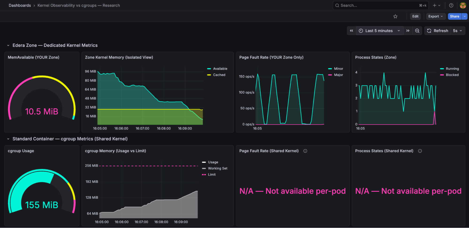
The kernel observer surfaces four signals that cgroups cannot provide. Let's walk through what's on screen. MemAvailable (top-left gauge, reading 10.5 MiB in pink): the kernel's own calculation of how much memory it can hand out to your application before things get bad. Unlike limit - usage, MemAvailable accounts for reclaimable page cache, kernel overhead, and slab reclaimability. It's a "how much runway does my application actually have" metric, not a "how full is the bucket" metric.
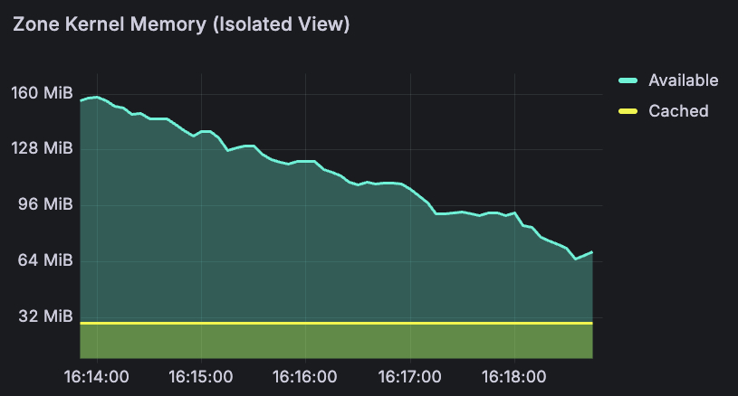
The memory timeline (top-center) tells the story over time. The turquoise line is MemAvailable - you can see it declining smoothly from 96 MiB to 10 MiB over the course of the run. The yellow band at the bottom is page cache, shrinking as the kernel reclaims it to feed the workload. Over 15 minutes, this gave a smooth countdown: 160 MiB → 85 MiB → 13 MiB → 7 MiB → 2.79 MiB → OOMkill. At any point, a platform engineer could have set an alert at 20 MiB and had minutes of lead time to react: scale up, trigger a restart, or page the on-call team before the crash.
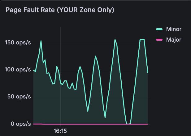
Page fault rate: captures minor faults (cache hits, normal) vs major faults (disk reads, 1,000-10,000x slower, bad). Look at the turquoise spikes hitting 150 ops/s — that's the kernel scrambling to reclaim pages as memory runs low. The pink major fault line stays near zero until the very end, when the kernel starts evicting cached pages and the workload has to be re-read from disk. This signal - "the kernel is actively struggling to find memory" - has no per-pod equivalent in cgroups.
Memory Pressure (PSI): the kernel's Pressure Stall Information metric, showing what percentage of time processes are stalling due to memory contention. On a dedicated kernel, PSI reflects only your workload's pressure. It rises before MemAvailable hits zero, giving the earliest possible warning.
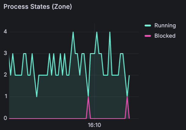
Process states : running (turquoise) vs blocked (pink) processes inside the zone. Notice the pink spikes appearing at the bottom - those are blocked processes. The kernel is stalling the workload to reclaim pages. A direct signal that performance is degrading right now. On a shared kernel, you'd have no idea whether blocked processes belong to your pod or a neighbor.
What cgroups showed: Usage vs Limit Only
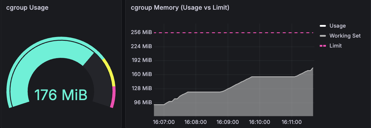
The gauge reads 176 MiB. The line chart shows usage climbing steadily toward the 256 MiB limit (the pink dashed line). That's the entire signal: a number going up. Usage climbed from 0 → 155 MiB → 204 MiB → 256 MiB. When it hit 256 MiB, OOMkill.
No indication that the kernel was struggling before the crash. No page fault rate, no process state, no pressure signal. Just a bucket filling up, until it overflows.
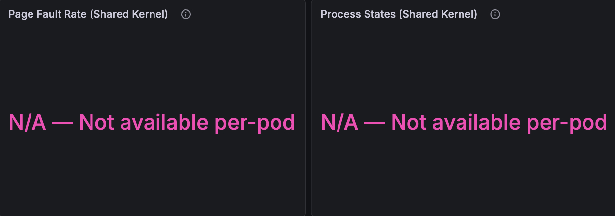
And then there are these two panels. Where the dedicated kernel showed page faults spiking to 150 ops/s and processes getting blocked, the shared kernel shows: "N/A — Not available per-pod." These metrics don't exist per-pod on a shared kernel. They can't - /proc/vmstat and /proc/stat reflect the entire node, not your container.
A careful reader will note that container_memory_working_set_bytes is a better signal than raw usage - it excludes inactive page cache. Our dashboard tracks both. But even working set doesn't give you what MemAvailable provides: the kernel's internal accounting of reclaimable slab, kernel overhead, and memory fragmentation. The working set tells you what your app is using, MemAvailable tells you what the kernel can still give.
The dashboard itself tells the story: where the dedicated kernel had four panels of rich, correlated data, the shared kernel had two panels reading "N/A — Not available per-pod."
The Noisy Neighbor: Invisible on Shared Kernel, Irrelevant on Dedicated
This is a multi-tenancy scenario that’s so common that every platform engineer knows it in their bones. We deployed the same target workload on both nodes, but we added a second memory-hungry pod on the shared-kernel node: a "noisy neighbor" allocating 4 MiB every 2 seconds with a 2 GiB limit.
The question: do the target pod's metrics show any signal that a neighbor is consuming 1.4 GiB on the same kernel?
Shared kernel: Invisible pressure
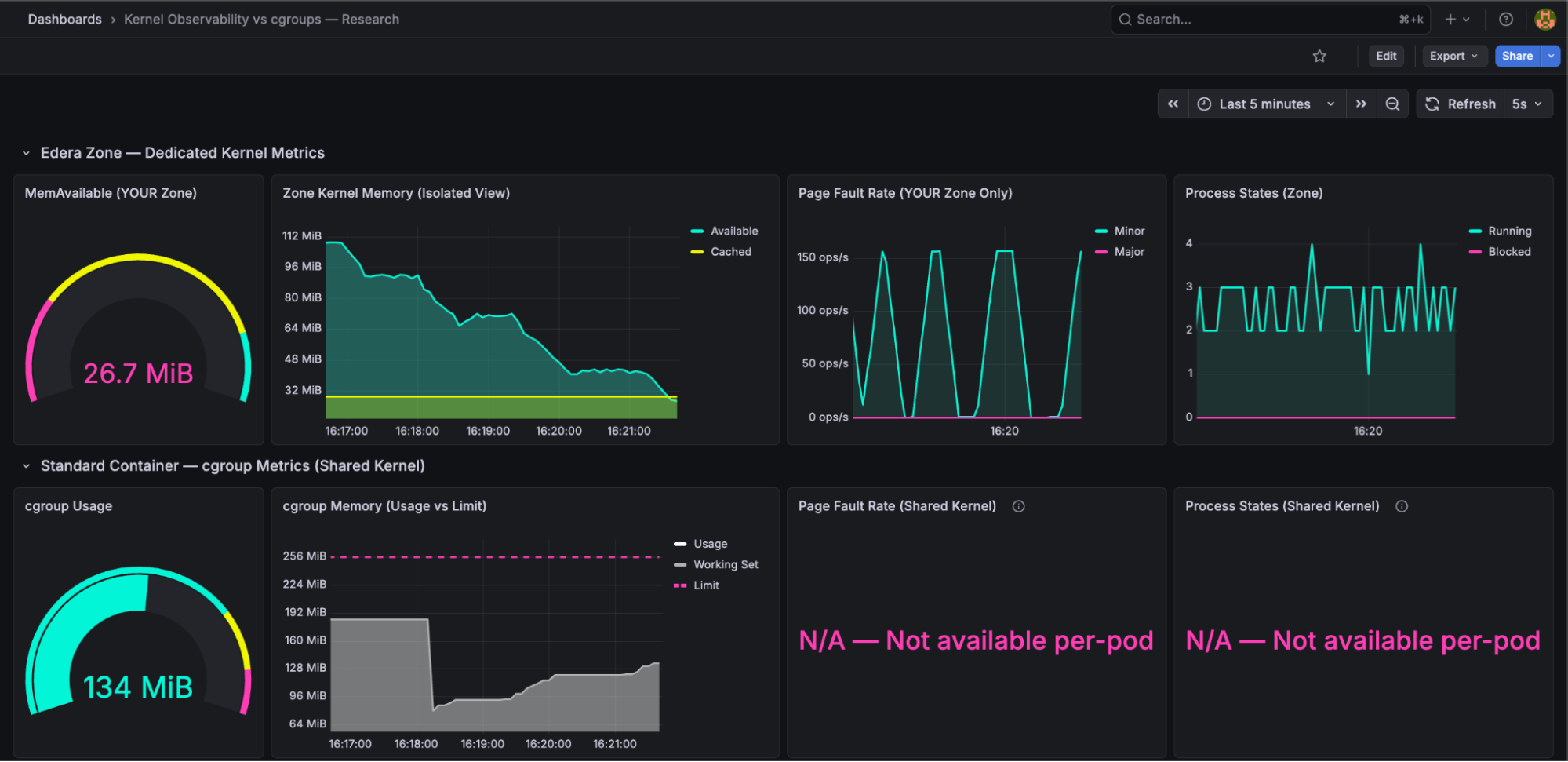
The target pod's cgroup metrics showed 134 MiB usage out of a 256 MiB limit. Nearly fifty percent headroom. A platform engineer looking at this dashboard would have zero reason to investigate. Everything looks fine.
Meanwhile, a neighbor was consuming 1.4 GiB on the same node's kernel. The shared kernel was under pressure, reclaiming page cache from every pod, and the target pod's file I/O was increasingly hitting disk instead of cache. But cgroup metrics for the target pod - the only per-pod metrics available on a shared kernel showed no signal.
Late in the experiment, the target pod's cgroup usage began accelerating unexpectedly - growing faster than its own allocation rate would explain. Was it the app? The neighbor? A kernel reclaim artifact? The cgroup metrics couldn't answer. There was no signal to diagnose.
Dedicated kernel: Unaffected
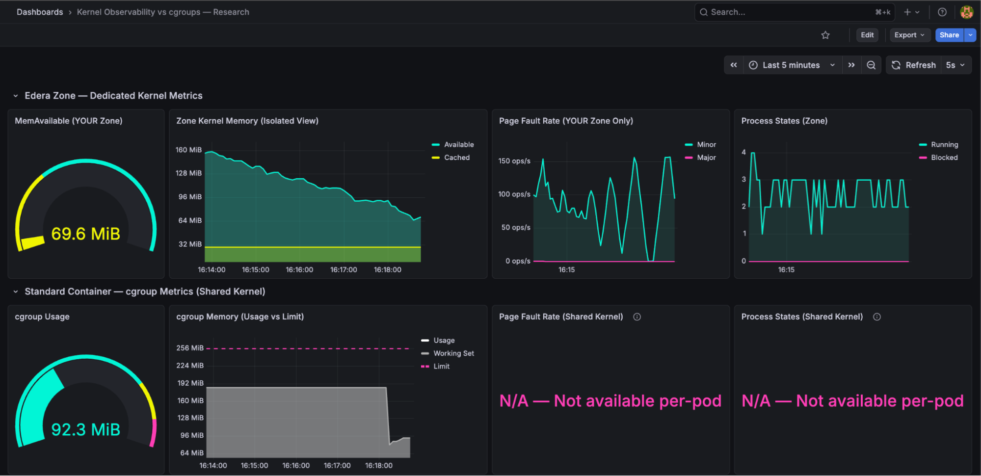
The Edera zone on the other Kubernetes node showed exactly what you'd expect: MemAvailable declining smoothly from its own workload's memory growth, page faults reflecting its own behavior, with no external noise. The noisy neighbor was architecturally irrelevant - it ran on a different node, but even if it had been on the same node, it would have been in a different zone with a different kernel. No cross-contamination is possible.
This is the isolation story: every signal on the dedicated kernel is directly attributable to the application generating the metrics. When MemAvailable drops, it's because your workload consumed memory. When page faults spike, it's your workload's pages being reclaimed. There are no ghosts in the data.
Does cgroup v2 PSI Solve This? Not Entirely
We want to address this directly because any experienced platform engineer will ask: "Doesn't cgroup v2 have per-cgroup PSI?"
Yes, it does. cgroup v2 introduced memory.pressure, which reports PSI at the cgroup level. This is a meaningful improvement to the Linux kernel and we don't want to diminish it.
However, per-cgroup PSI on a shared kernel still has limitations. The kernel's memory reclaim is a global process. When one cgroup triggers a reclaim, the kernel scans pages across all cgroups to free memory. This global reclaim activity can cause PSI readings in cgroups that are not the source of pressure. Direct reclaim triggered by one cgroup's allocation can stall allocations in other cgroups that happen to allocate at the same time.
Per-cgroup PSI is better than nothing but it is not a clean signal. On a dedicated kernel, PSI reflects only your workload's pressure because there is no other workload on that kernel. The signal is unambiguous.
What This Means for Platform Engineers: Dedicated Kernel Metrics Let You Right-Size and Stop Over-Provisioning
The 40-50% over-provisioning tax that the industry accepts is a symptom of insufficient signal. Teams over-provision because they don't have confidence to right-size their applications. They don't have confidence because the metrics available today - cgroup usage vs limit - don't answer the question that matters: "Is the kernel comfortable?"
MemAvailable answers that question. It's the kernel's own assessment of how much headroom your workload has, accounting for reclaimable memory, kernel overhead, and internal fragmentation. When MemAvailable is stable at 30% of your zone's memory over 30 days, you can confidently reduce your limit. When it starts declining, you know why, and you can act before the OOMkill.
Page faults tell you whether the kernel is struggling right now. PSI tells you whether processes are stalling. Process states tell you whether your workload is blocked on I/O. Together, these signals provide a multi-dimensional picture of kernel health that cgroup usage/limit simply cannot replicate.
And on a dedicated kernel, every signal is clean. No noisy neighbors, no cross-contamination, no ghosts.
This is the observability side of the same multi-tenant isolation story. The same dedicated kernel that lets you run more tenants on less infrastructure also gives you the per-pod kernel metrics to right-size every one of them.
Run the Experiment Yourself
We've published the experiment as an open-source repository so you can reproduce these results independently.
The repo includes the Go workload source code, Kubernetes manifests for both scenarios, Prometheus scrape configs, and the Grafana dashboard JSON. Deploy it on any cluster with one standard node and one Edera node, and see the signal difference for yourself.
We didn't write this post because we think cgroups are bad. cgroups are a foundational Linux feature that makes Kubernetes possible. We wrote it because we believe platform engineers deserve better signals than what a shared kernel can provide. Dedicated kernels make those signals possible.
Every month you wait to right-size is another month of 40% wasted compute on your cloud bill. That's not a rounding error: on a 500-pod fleet, that's six figures annually going to memory your kernels already know you don't need. We built the tooling to prove it. Run our experiment, see the signal difference, and when you're ready to stop paying the over-provisioning tax, talk to us.
FAQ
What is MemAvailable and why is it better than cgroup memory usage for Kubernetes pods?
MemAvailable is the Linux kernel's own calculation of how much memory it can allocate to your application before things degrade. Unlike cgroup usage, it accounts for reclaimable page cache, kernel overhead, and slab reclaimability. On a shared kernel, MemAvailable reflects the entire node, not your pod. On a dedicated kernel — such as an Edera zone — MemAvailable reflects only that pod's memory state, making it a reliable signal for right-sizing.
Why do platform engineers over-provision Kubernetes memory limits by 40–50%?
Because cgroup metrics only show usage relative to a limit — they cannot indicate whether the kernel is under pressure, whether memory is reclaimable, or whether a noisy neighbor is causing reclaim activity. Without these signals, teams set limits high and accept wasted compute as an insurance policy against unexpected OOMkills.
Can cgroup v2 PSI replace per-pod kernel metrics on a shared kernel?
Partially. cgroup v2 introduced per-cgroup memory.pressure, which is a meaningful improvement. However, the Linux kernel's memory reclaim is a global process: when one cgroup triggers reclaim, the kernel scans pages across all cgroups, which can cause PSI readings in cgroups that are not the source of pressure. On a dedicated kernel, PSI reflects only that workload's pressure because no other workloads share the kernel.
What kernel metrics are unavailable on a shared-kernel Kubernetes node per pod?
Page fault rate (/proc/vmstat), process states (/proc/stat), MemAvailable (/proc/meminfo), and kernel PSI that is uncontaminated by neighboring workloads are all unavailable on a per-pod basis on a shared kernel. These metrics reflect the entire node, not individual containers. cadvisor and cgroup accounting cannot surface them at pod granularity.
How does a noisy neighbor affect Kubernetes pod memory metrics on a shared kernel?
On a shared kernel, a memory-hungry neighbor triggers kernel-wide reclaim, which evicts page cache from all pods on the node — including pods that appear healthy in their own cgroup metrics. The affected pod's file I/O increasingly hits disk rather than cache, but its cgroup usage metric shows no signal. The degradation is invisible until it manifests as latency or an unexpected OOMkill.
-3.avif)